By Aiden Plumbe
“A picture tells a thousand words“
You’ve probably heard the phrase before, and it’s mostly true. In the modern day, we use pictograms for many things that we don’t often notice. They’re the little man and woman outside the bathroom; or the simple red circle around a cigarette, which displays a clear message. Pictograms allow people to communicate through universal symbols. They close the gap between different languages. Throughout the history of the Olympic Games, pictograms have been utilised to represent sports. A simple symbol that correlates to the sport means that the 206 countries with different languages can understand the Games. The Olympics uses specially made pictograms for places at the venue, allowing athletes as well as watchers understand the Games. Over time, these pictograms have evolved and adapted to different themes.
But first, what makes a good pictogram? A successful pictogram needs four integral things. Firstly, it should be instantly understandable and its meaning clear, regardless of language. Secondly, it should be readable at all scales. Someone should be able to recognise it at a glance, even from far away. Thirdly, pictograms are normally made in sets, especially in the case of the Olympics. For this reason, the pictograms should be aesthetically consistent in their design style. Lastly, it is essential that each pictogram is unique enough so that they are not confused with others in the set.
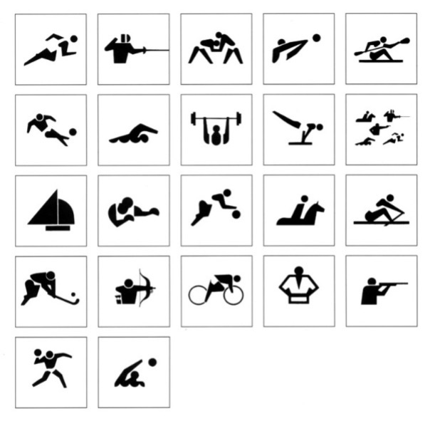
Now, let’s talk about the very beginning of pictograms in the Olympic Games. The first pictograms were used in the 1964 Tokyo Olympics in order to solve communication difficulties and way-finding problems for international visitors who couldn’t read Japanese. As well as the 20 sport pictograms, there were also 39 pictograms for navigating around facilities and services. These pictograms included a figure in an emblatic pose with a clear uniform or accessory necessary for the sport. Since then, pictograms have largely followed the same sort of style with the exception of the 1968 Mexico Olympics.
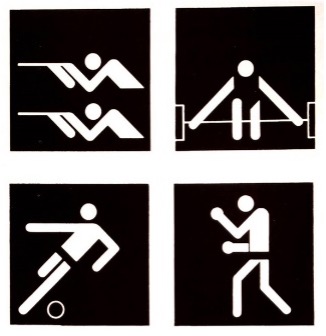
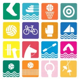
The very next Olympics, the pictograms’ design and style was completely altered. Instead of focusing on the human figures, the designers chose a more abstract take, featuring equipment or a single limb from the sport. From a consistency point of view, the standards for these pictograms drop. Some are quite simple and geometric whilst others obviously different. It feels like they were designed without a common goal. The following Olympic Games in Munich 1972 went in the complete opposite direction. Designed by Gerhard Joksch, this set features figures comprised solely of 90 and 45 degrees angles. These pictograms were so successful that the same style was utilised for the 1976 Olympics.

In 1992, this design style is broken as Josep Maria Trias strives for a much looser design. We are given artistic brushstrokes to represent figures. Some reasons this could have occurred was to break the established conventional view of these symbols. Another possibility is the advance in digital design tools. The next evolution of the pictogram happened in the 1994 Winter Olympics in Norway. Sarah Rosenbaum integrated the local history by taking inspiration from a 4,000-year-old rock painting which is thought to be the first known depiction of a person on skis. This inspired a movement to stray from the traditional style of pictograms.
In Sydney 2000, Athens 2004 and Bejing 2008, there is a clear sequence of cultural significance in their designs. For the 2000 Olympics, the boomerang; 2004 inspired by antique vases; 2008 being ancient Chinese seals. Later on, the pictogram begins to connect to the theme or emblem of the Games as advertising. Rio 2016 Olympics included the first set of pictograms for the Paralympic Games.
But what do the pictograms look like for this Olympics? Well, the 2024 Paris Olympics have undeniably veered away from the traditional pictogram entirely. The brand director for the Games, Julie Matikhine, has even said that “Pictograms are a relic of the past. We launch the concept of the coat of arms.” These ‘coat of arms’ include three key features. Firstly, they have an axis of symmetry, often mirrored on the diagonal. Next, it contains a depiction of the sport’s playing grounds. Lastly, there is a representation of the sport which could be through an essential piece of equipment in the sport. It is notable that there is no representation of the players, which the designers claim is to make it more inclusive in the modern age.
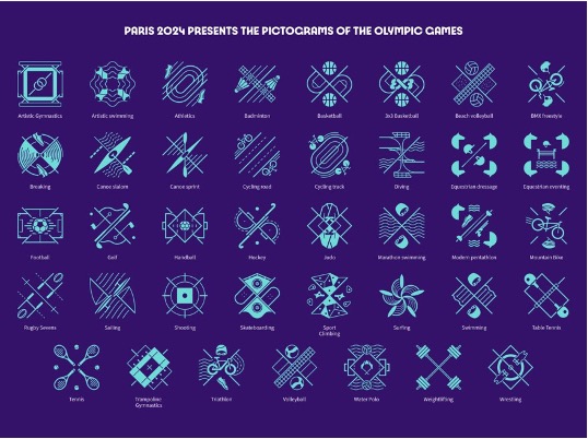
Let’s compare these new pictograms to the original criteria that was established at the beginning. Is the meaning clear? I would say that the original pictograms are undeniably less cluttered than these new representations and convey the idea with more simplicity. Is it understandable from far away? The cluttered nature of these ‘coats of arms’ make it difficult to comprehend from a distance. Is the design consistent? The new pictograms receive a tick for this category as their overall theme is extremely related. Is each pictogram individual? Quite a few of the new pictograms are easily confusable due to similar playing equipment and grounds.
Overall, pictograms have carved their mark into the history of the Olympic Games. They are an undeniable factor of the Games that bring character and identity to each year’s Olympics. They have come a long way from filling in for Japanese script to being coats of arms. We can only wait until the next Games to see what the designers decide to do with pictograms.